MYTOYS GROUP
The MYTOYS Group is Europe’s leading online retailer for family shopping. The award-winning Group is home of myToys, Limango, Mirapodo and Yomonda.
As the Lead UX Designer, I brought user-centric design and business needs together with strategic insights to create solutions, products, and services for MYTOYS GROUP’s multishop concept.
Google Core Web Vitals Hall of Fame (User Experience), Increasing overall Conversion, myToys App – 4,7 stars (2.447 reviews) at the App Store, implementing a UX/HIC Audit to screen every feature based on ISO 9241-110, SUS Score from 69 to 86
Create intuitive simple and beautiful interface, Create smooth user experience in any device, Increase the usage delight, Make it brandable, Make it performant, Make it scalable
Analyzed customer data to create insights and hypotheses, Ideation, User Flow, Scribbles, Design execution and validation, Agency management
Scribbles and Wireframes, Paper Prototypes, Sketch, Principle, Invision App, Jira and Confluence
Articles & References
[…] ist die App für iOS und Android, die mit guter Benutzerführung und einem klaren Design punktet.
[…] Von den besten lernen: Unternehmen in der Core Web Vitals Hall of Fame – mytoys.de
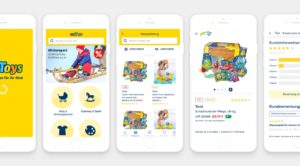
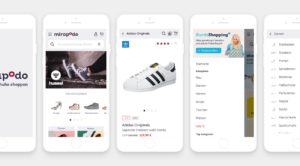
The myToys App and mirapodo App – 100.000 products, 4 million shoppers
I designed myToys’ and mirapodo’s first native mobile application in close collaboration with external agencies as part of MYTOYS Groups’ product development strategy.
Animations and transitions within the myToys app
Creation of animation and transitions to visualize all app functions within the app and websites to support the handover to the developers and present it to C-level management and team. These animations were created with Principle.
myToys App: Product detail page add to card and recommendations animation / behavior
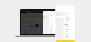
myToys Mobile: Vertical filter for a better overview of the many filter attributes
A modular component system for all MYTOYS Group platforms.
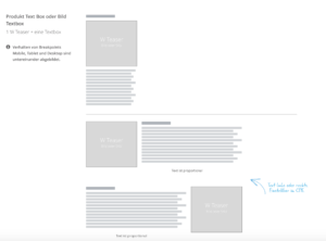
Transitioned each online-shop from a static design-approach to a modular and responsive system for all subsidiaries within the multishop ecosystem, including full responsive teaser elements for marketing campaigns, operated via a CMS. This enabled shop managers to create flexible sites through modular elements, which reduced front-end tech deb, lead-time to features, and ensured the best User Experience.
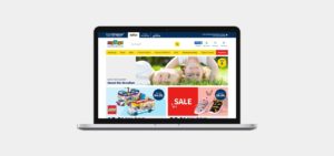
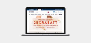
One codebase, one template, four eCommerce shops
Four eCommerce shops on one platform with a modular shared template system and bespoke design elements like typography, colors, icons, and content. This modular system reduced lead-time to features significantly and ensured the best User Experience.
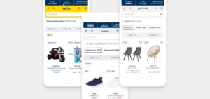
A revolutionary category filter design for all platforms
All MYTOYS GROUP subsidiaries faced the primary challenge that filters and attributes were horizontal, which caused the filters not to be seen within the viewport on mobile devices. To improve the overview and user experience, I designed a vertical arrangement. The hypothesis that this would significantly improve the Step-Conversion and Usability was confirmed with an A/B test. The new filter was implemented on mobile and desktop.
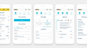
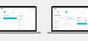
Combishopping-Checkout redesign
To create a seamless shopping experience for combi shoppers on all four stores, a single checkout, leading the shopper to the same checkout for all shops, was created. One of the significant challenges was integrating all the requirements of the subsidiaries, which were different and partly opposing.
This redesign was achieved by analyzing shopper data, creating and analyzing user tests, and using UX best practice approaches to develop scribbles and designs.
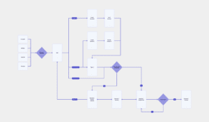
Project approach insights
A view on my approaches to various projects, like the myToys app, combi-shopping checkout, the UX audit I introduced, and the integration of PAYBACK (Germany’s leading bonus program).
Project flow
Redesign checkout “Combi-Shopping.”
4 Shops – 1 login – 1 Order – Redesign to create a seamless shopping experience
Constant screening of shops from competitors and other industries to identify and document best practice patterns
Clarified requirements and built the information architecture in an easy to understand level — created user flow to ensure that the product prioritizes the shopper’s needs.
Strong collaboration with optimization/web analytics specialists to diagnose specific issues and identify areas of improvement. Existing, relevant usability and A/B tests were used within the designs process.
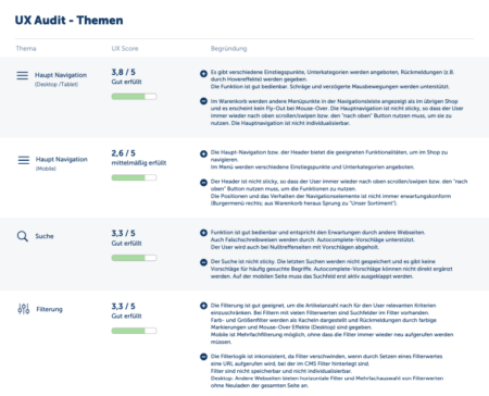
Established a recurring UX audit, to screen and score features against UX standards (ISO 9241-110), which was also used for this project. Based on the analysis of factors like task adequacy, self-descriptiveness, conformity with user expectations, customizability and fault-tolerance, recommended actions, and A/B tests for the checkout redesign were defined.
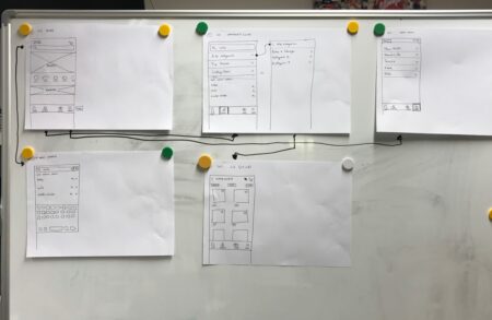
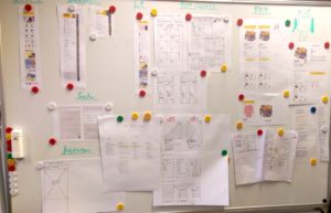
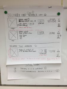
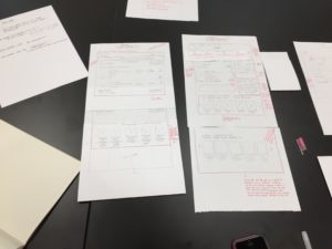
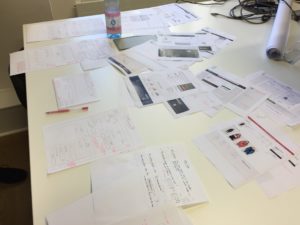
Based on available and analyzed information, scribbles were used and discussed during the ideation stage of the design process, to support the team in proposing, exploring, refining, and communicating the design ideas.
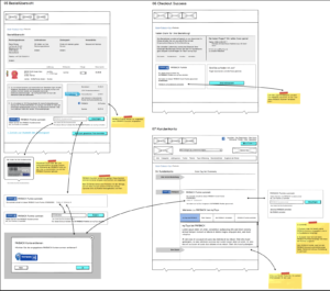
To achieve a well-structured layout, the team prepared the specification of the elements that we had within the check out to eliminate inconsistencies in the appearance. With an iterative approach and A/B tests, the design team was able to update the check-out based on performance.
Through an excellent designer-developer collaboration process, the team ensured a successful design handoff with Invision App.
