The UX Dashboard
One view. Shared by everyone who matters.
Key Takeaways
A UX dashboard makes product quality measurable and visible. Track the right metrics, structure it for your audience, and make sure someone owns it. Without that last part, it’ll be abandoned in six weeks.
In this article
Most teams have more data than they know what to do with.
Analytics dashboards, session recordings, NPS surveys, support tickets, A/B test results – all sitting in separate tools, owned by separate people, reviewed in separate meetings. Meanwhile, the questions that actually matter go unanswered. Is the checkout getting better or worse? Do mobile users struggle more than desktop users? Which onboarding step loses the most people?
A UX dashboard doesn’t add more data to that pile. It pulls together what already exists and gives you one maintained view of how your product is performing for users.
That shared visibility changes conversations. You stop arguing about opinions and start discussing numbers.
What Belongs in It
One view.
All signals.
A UX dashboard connects design quality, user behaviour,
and business outcomes in a single place.
Without it, every team is optimising for something different.
The right metrics depend on your product, but a core set applies almost everywhere.
Task success rate. Can users actually complete the key things your product was built to do? If you only track one thing, track this.
Task completion time. Faster isn’t always better – some decisions deserve deliberation. But a sudden spike in completion time usually signals something broke.
Conversion rate. For products with a clear goal action – purchase, signup, upgrade – conversion tells you whether UX is enabling or blocking it. Break it down by device type for extra signal.
Retention. Users who don’t come back aren’t satisfied. Retention reflects whether the experience actually delivers on what the product promises.
Error rate. High error rates in specific flows are rarely an accident. They’re almost always pointing at something broken – technically or experientially.
Support ticket volume by category. Often the most practical thing on the dashboard. When the same categories keep appearing, those aren’t support issues. They’re UX problems wearing a costume.
Satisfaction score. NPS or CSAT, paired with the quantitative data. A low NPS without context is hard to act on. Combined with where users are dropping off, it starts telling a story.
Five focused metrics beat twenty impressive ones. Every time.
Structure It in Three Layers
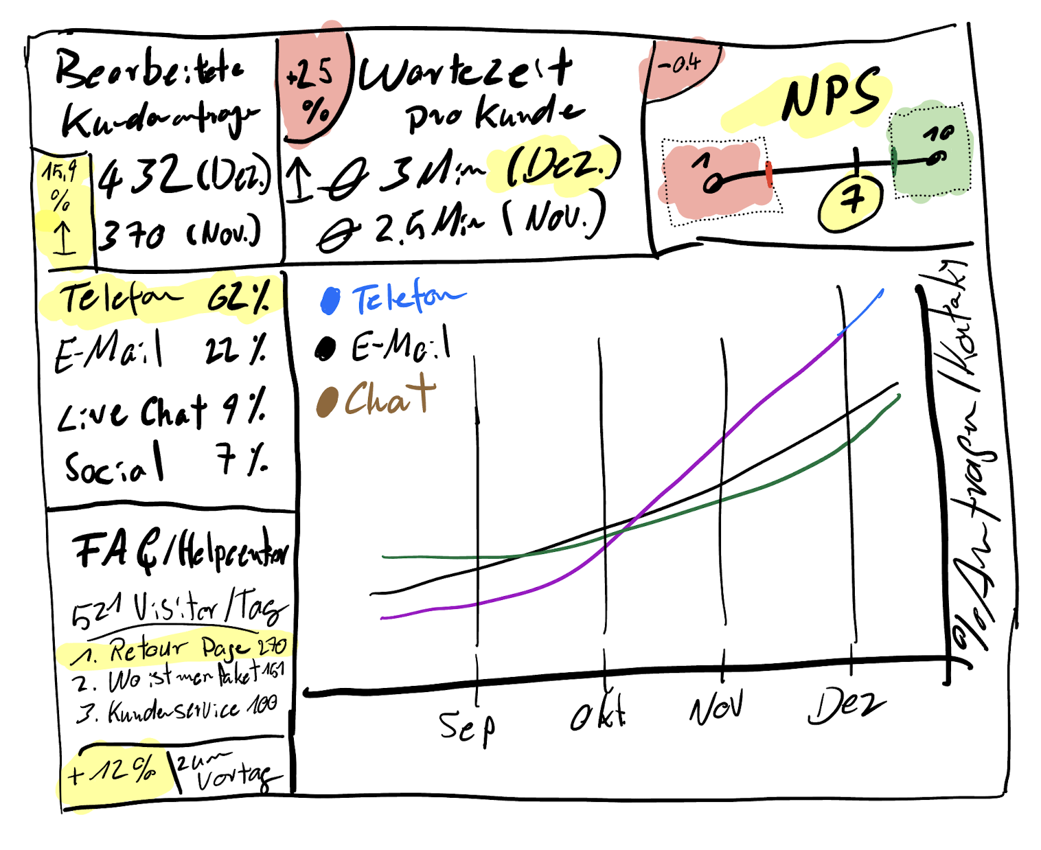
The dashboards that get used consistently have a clear hierarchy. The ones that get ignored try to show everything to everyone.
Layer 1 – Health status
Three to five metrics with simple trend indicators: green, amber, red. Anyone in the organisation should be able to read this in thirty seconds and know whether things are getting better or worse.
Layer 2 – Trend charts
A single data point means almost nothing. Trends tell the story. Show movement over four to twelve weeks – seasonal drops, improvements after a release, regressions after a change.
Layer 3 – Drill-down by flow
Where exactly is the problem? Navigation, onboarding, checkout, search? This layer is for the team actively working on improvements. It answers “where to focus” rather than “are things okay.”
Why Most of Them Fail
I’ve seen dashboards built with genuine care and abandoned within six weeks. The same reasons keep coming up.
No owner. A dashboard without a responsible person is a dashboard that stops getting updated. Assign it explicitly. Fifteen minutes a week is all it takes – but someone needs to own those fifteen minutes.
Too many metrics. When everything is tracked, nothing gets prioritised. Five to eight metrics is enough.
Built for the team, not for stakeholders. If the dashboard only makes sense to people who already understand UX, it won’t create the broader visibility you need. Layer 1 should be readable by anyone.
The Silo Problem: Why Disconnected Dashboards Miss the Point
Here’s a thing that doesn’t get talked about enough.
Product tracks conversion. Marketing tracks acquisition. CX tracks support volume. Operations tracks fulfillment. Each team has their own dashboard. Each dashboard is technically accurate. None of them show what’s actually happening to the customer.
A conversion drops. Product attributes it to a UX problem. The real cause is a delivery delay sitting in the operations data that nobody shared. An NPS score falls. The signal is in a CX report that the product team never opens. The dependencies exist. They’re just invisible because the data lives in separate tools, reviewed in separate rooms.
This becomes especially damaging in omnichannel environments – where a customer discovers a product via a social ad, researches it on mobile, buys on desktop, and contacts support through an app. Each touchpoint generates data. If that data never connects, you’re optimising individual channels while the overall experience silently deteriorates.
The dashboards that actually move decisions are built across silos, not inside them. That requires a shared data foundation, a cross-functional view of dependencies, and someone with the mandate to keep it maintained. It’s as much a governance problem as a technical one.
A dashboard that only shows your slice of the experience doesn’t show the experience. It shows your assumptions about it.
From What to Why
The dashboards that have the most impact don’t just show what happened. They connect quantitative signals to qualitative explanation.
That means integrating session replay and heatmap data alongside the metric charts. When retention drops 8% in week three of onboarding, a heatmap of that specific screen and a session replay of users who dropped off tells you what the number can’t – where people hesitate, what they click first, where they stop. Rage taps on a button that isn’t responding. Scroll depth showing nobody reads the instructions above the fold.
Tools like Hotjar, Microsoft Clarity, or FullStory make this accessible for teams of any size. The key isn’t the tool – it’s connecting the qualitative signal to the quantitative data rather than running them in separate systems nobody ever cross-references.
A dashboard that shows a number going down without explaining why is just an anxious graph. The why is the useful part.
What to Do Next
- Define three metrics that genuinely reflect your product’s UX quality – not page views, but task completion, error rate, or time-on-task.
- Set up a simple shared view even if it starts as a spreadsheet. The format matters less than making it consistently visible to the right people.
- Include it in one recurring stakeholder meeting. A dashboard that nobody looks at is just a filing system. Regular visibility is what gives it power.
Sources & Further Reading
The metrics and measurement approaches in this article draw on established UX and product analytics literature:
- Nielsen Norman Group. Usability Metrics. Defines the core quantitative measures for evaluating user experience.
- Nielsen Norman Group. Benchmarking UX: Tracking Metrics Over Time. Why consistent measurement cadence matters more than any single data point.
- Nielsen Norman Group. Measuring Perceived Usability. Covers satisfaction measurement methods including SUS and single ease questions, relevant for the CSAT/NPS layer of a UX dashboard.
- Interaction Design Foundation. UX Research. IxDF. Covers the qualitative methods that complement quantitative dashboard data.
- A List Apart. User Research Is Storytelling. A compelling argument for combining data and narrative when presenting UX insights to stakeholders – directly relevant to how you share what a dashboard shows.
- User Interviews. UX Research Field Guide. Useful for teams building the qualitative layer alongside their quantitative dashboard.
René Manikofski is a Senior UX Designer with 10+ years of experience in e-commerce and digital product design across Europe. All articles are based on personal professional experience and supported by AI in writing.