The UX Audit
What you find when you finally look honestly
Key Takeaways
A UX audit reveals usability problems hiding in plain sight. It doesn’t require users – just a framework, fresh eyes, and the willingness to document what you find. The hard part isn’t running it. It’s getting people to act on it.
In this article
Here’s something that happens more often than it should.
A product ships. Users start dropping off at a specific step. Nobody knows exactly why. There’s a meeting. Someone suggests user testing. Someone else says – actually, can’t we just look at what we already have first?
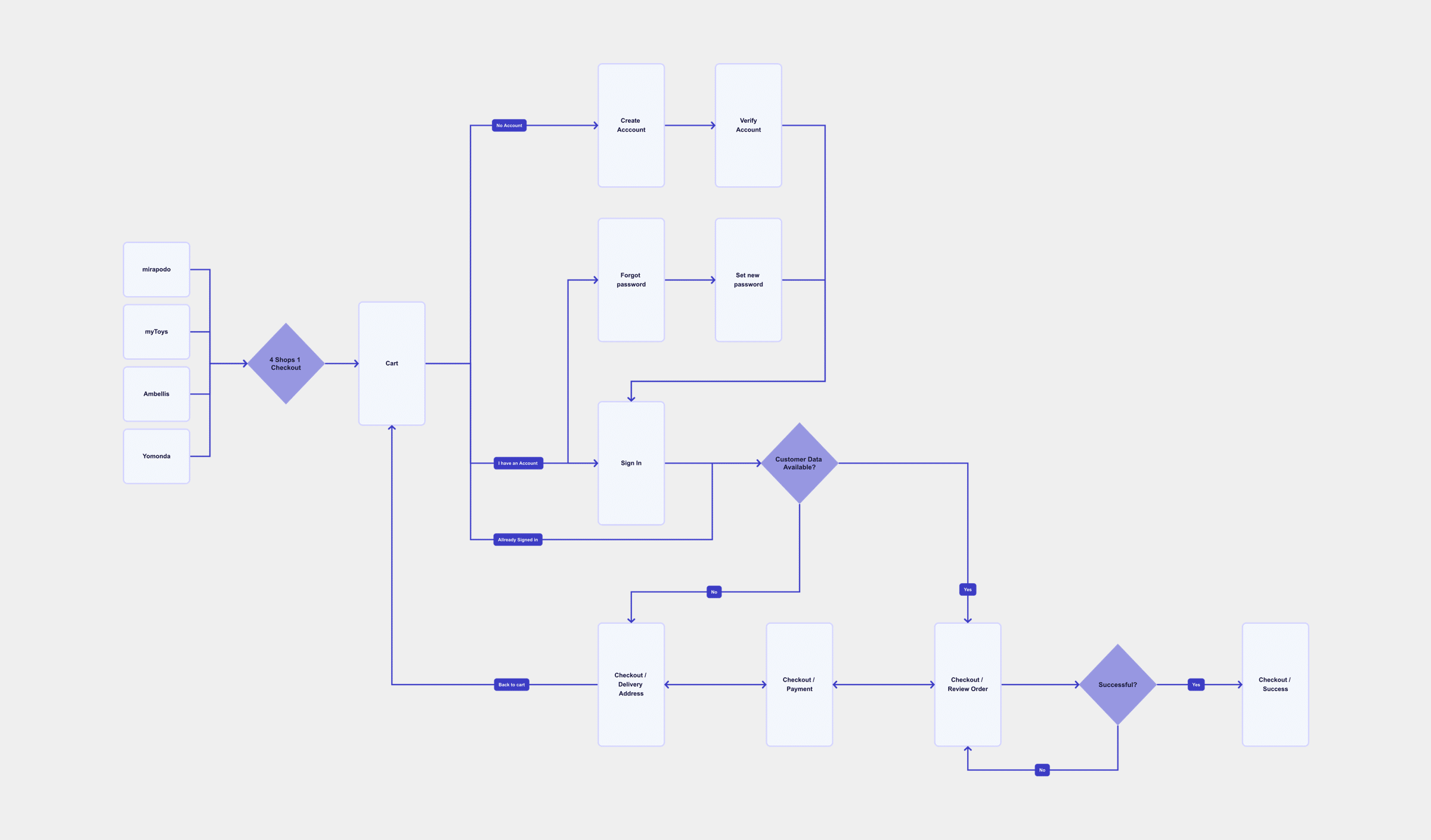
That’s a UX audit. And it’s one of the most underused tools in product design.
What a UX Audit Actually Is
A UX audit is a structured expert review of your product’s usability. No users required. No lab setup. Just a trained eye, a clear framework, and a product that’s ready to be looked at honestly.
The goal isn’t to find everything. It’s to find the things that matter – the friction points, the broken flows, the moments where a user silently gives up and nobody notices because the drop-off just looks like a number in an analytics dashboard.
I’ve run these across e-commerce checkouts, onboarding flows, mobile apps, and internal tools. Every time, I find things the team had stopped seeing because they’d been looking at the same screens for months. That’s not a criticism – it’s just how familiarity works. You stop seeing the door you walk through every day.
Fresh eyes aren’t a luxury. They’re the whole point.
How to Run One
Start with the most-used flows
Not the homepage, not the settings page nobody opens. The checkout, the onboarding, the search. Wherever users actually spend their time and make decisions.
Walk through each flow as if you’ve never used the product
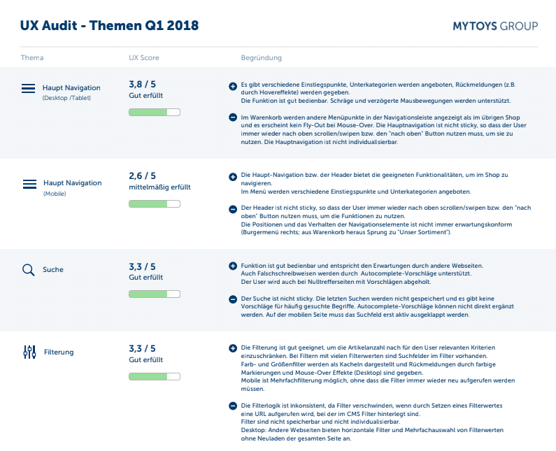
Use a framework to stay structured. Nielsen’s 10 Usability Heuristics are a solid starting point – covering error prevention, consistency, feedback, and user control.
Document every friction point without justifying it
The confusing button label. The error message that explains nothing. The form asking for information too early. Write it all down. Don’t think “users will figure it out.” That’s how problems ship.
Prioritise findings by severity × effort
Don’t hand over a spreadsheet of 80 issues. Lead with the top five or six. What breaks the experience most, and what’s fastest to fix? That’s what product teams act on.
What You Actually Find
A few things come up almost everywhere.
Navigation problems. Users can’t find what they’re looking for, or they find it but they’re not sure they’re in the right place. Related: inconsistent labelling, where the same feature has three different names depending on where you are in the product.
Error states that don’t help. The classic: “Something went wrong.” Thanks. Really narrows it down.
Missing feedback. The user clicks something and nothing happens for two seconds. Is it loading? Did it work? Did the internet die? Nobody knows.
Forms that ask too much, too early. Asking for a phone number before someone’s even decided they want to sign up is a guaranteed way to lose them.
Accessibility gaps – missing alt text, poor colour contrast, interactions that only work with a mouse. These affect more users than most teams assume.
Accessibility Belongs in the Audit

One area that still gets treated as optional: accessibility. It shouldn’t be.
A proper UX audit includes checking against WCAG 2.1 AA as a baseline – colour contrast ratios, keyboard navigability, focus states, screen reader compatibility, and touch target sizes on mobile. The Web Accessibility Initiative estimates over 1 billion people globally live with some form of disability. And accessibility failures are increasingly a legal risk, not just a UX one.
The good news: automated tools like axe, Lighthouse, and WAVE catch a significant portion of technical violations fast. They cover around 30–40% of WCAG issues without any manual effort. That’s a useful first pass – but it doesn’t replace walking through critical flows with a keyboard and a screen reader.
Worth knowing: AI-assisted audit tools are entering professional workflows. Some can flag heuristic violations at scale across large product surfaces faster than any single reviewer. They don’t replace the structured human review – but they’re changing how much ground one person can cover in a day.
How to Make Findings Useful
The audit itself is the easy part. The harder part is turning findings into something people act on.
Score each issue by severity – a simple 1 to 3 scale works fine. Critical means it blocks users from completing a task. Moderate means it causes confusion or extra effort. Minor means it’s annoying but manageable. This turns a list of observations into a prioritised backlog.
Then translate findings into business terms. Not “the error message is unclear.” But “users who hit this error in checkout are 40% less likely to complete a purchase.” One of these gets nodded at in a design review. The other gets put on a roadmap.
40%
Users who hit an error in checkout are 40% less likely to complete their purchase.
Most of these errors are fixable in days.
Present findings to stakeholders who influence the roadmap. Keep it short, keep it visual where possible, and focus on impact rather than critique. The goal isn’t to show what’s wrong – it’s to show what’s worth fixing first.
What to Do Next
- Pick one critical user flow and walk through it yourself today – not as a designer, but as a first-time user. Note every moment of friction without justifying it.
- Score what you find. Use a simple severity scale (1–3) so findings become a prioritised list, not just a collection of observations.
- Share the output with one stakeholder who influences the roadmap. Frame it in impact terms: where are users dropping off, and what does that cost?
Sources & Further Reading
The points in this article are grounded in established UX research and my own practice. If you want to go deeper:
- Nielsen, J. (1994). 10 Usability Heuristics for User Interface Design. Nielsen Norman Group. The foundational framework behind every heuristic evaluation.
- Nielsen, J. & Molich, R. How to Conduct a Heuristic Evaluation. Nielsen Norman Group. Step-by-step guidance on running an expert review.
- Nielsen Norman Group. UX Expert Reviews. Overview of expert review methods and when to use them.
- Nielsen, J. Severity Ratings for Usability Problems. Nielsen Norman Group. The 1–4 severity scale I use in every audit.
- Interaction Design Foundation. Heuristic Evaluation. IxDF. A comprehensive overview of the method, including common pitfalls and how to involve multiple evaluators.
- Hotjar. How to Do a UX Audit. Practical walkthrough with a checklist, including how to combine expert review with behavioural data from heatmaps and recordings.
- Laws of UX. Jakob’s Law. Users spend most of their time on other sites. A key principle when evaluating pattern consistency in any audit.
René Manikofski is a Senior UX Designer with 10+ years of experience in e-commerce and digital product design across Europe. All articles are based on personal professional experience and supported by AI in writing.